Jisho.org
Main Problems
1. Lack of Interconnection
Gaps in the Sitemap
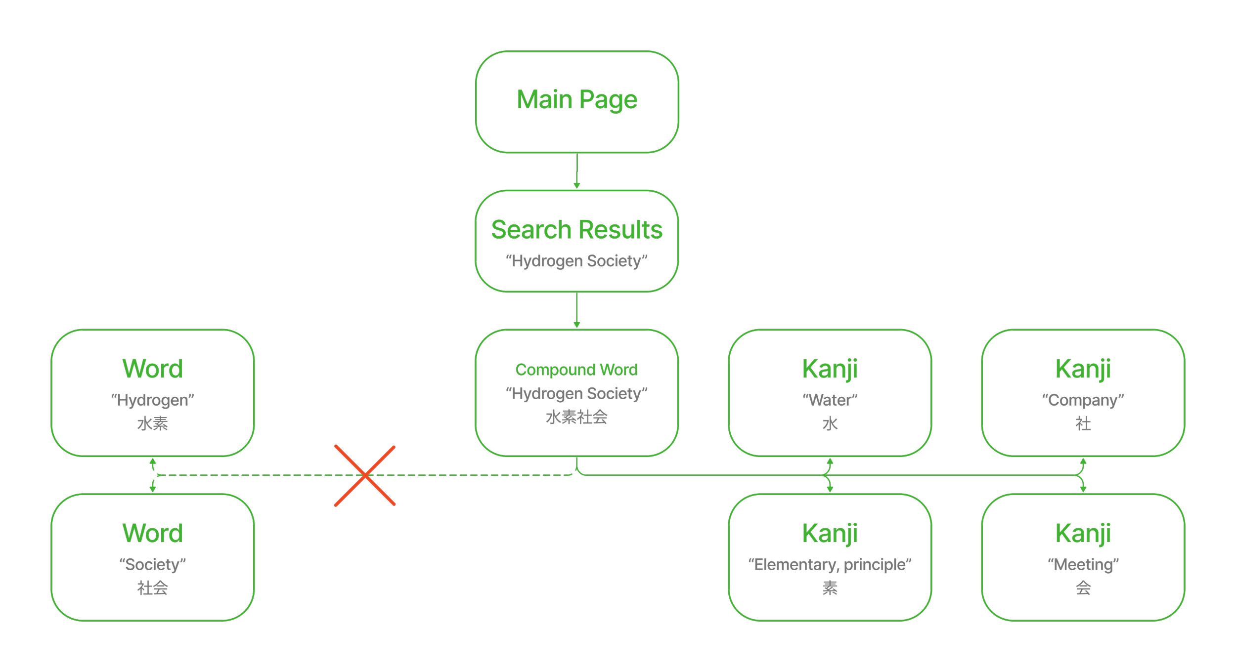
Individual words cant be clicked from compound words
2. Lack of visual dividers
No hierarchy or color disctinction
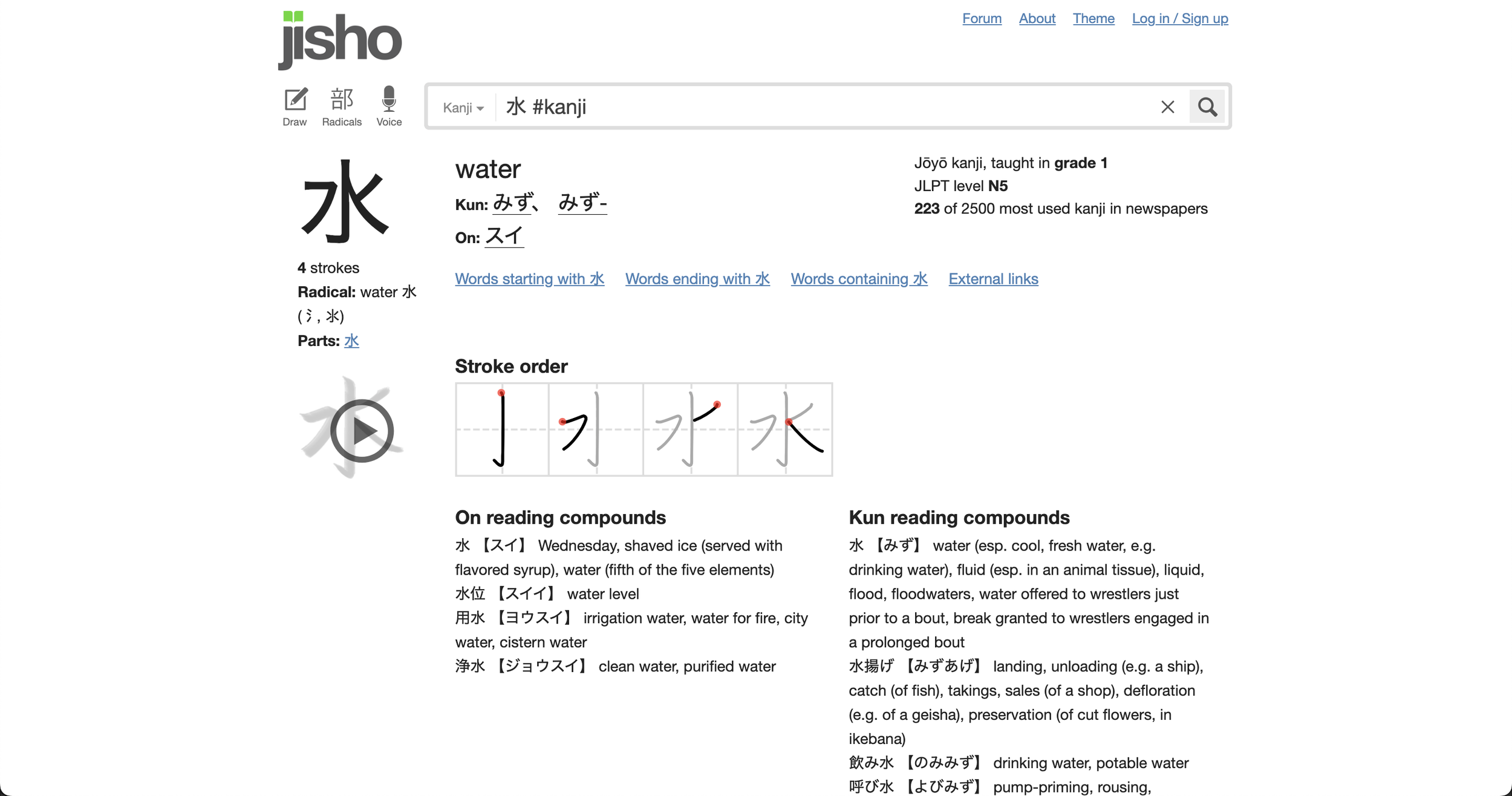
“On” readings and “Kun” readings look the same
3. Visual Clutter
Unnecessary components
Lack of visual order or consistency
P R O B L E M O N E
Lack of Interconnection
In it’s current design, users are able to jump from the compound words to individual characters but not to the individual words that make up the compound word. This break in the flow prevents users from being able to decipher what words make up a compound word.
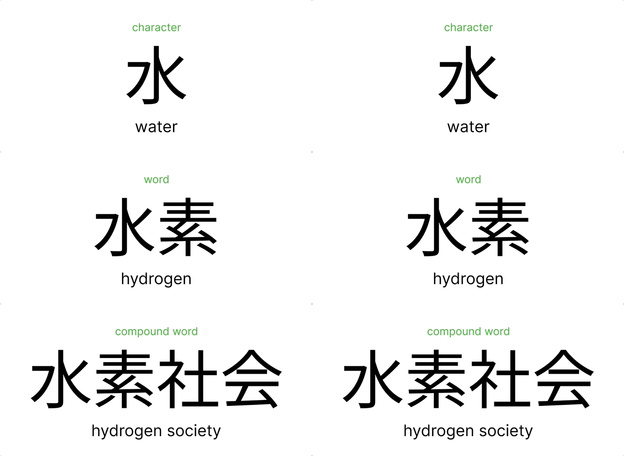
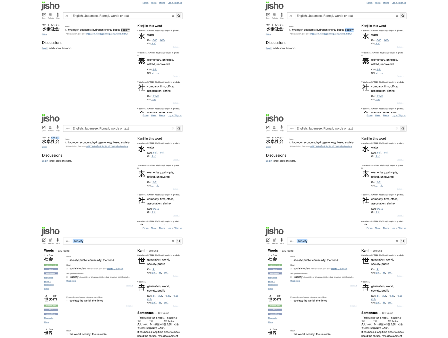
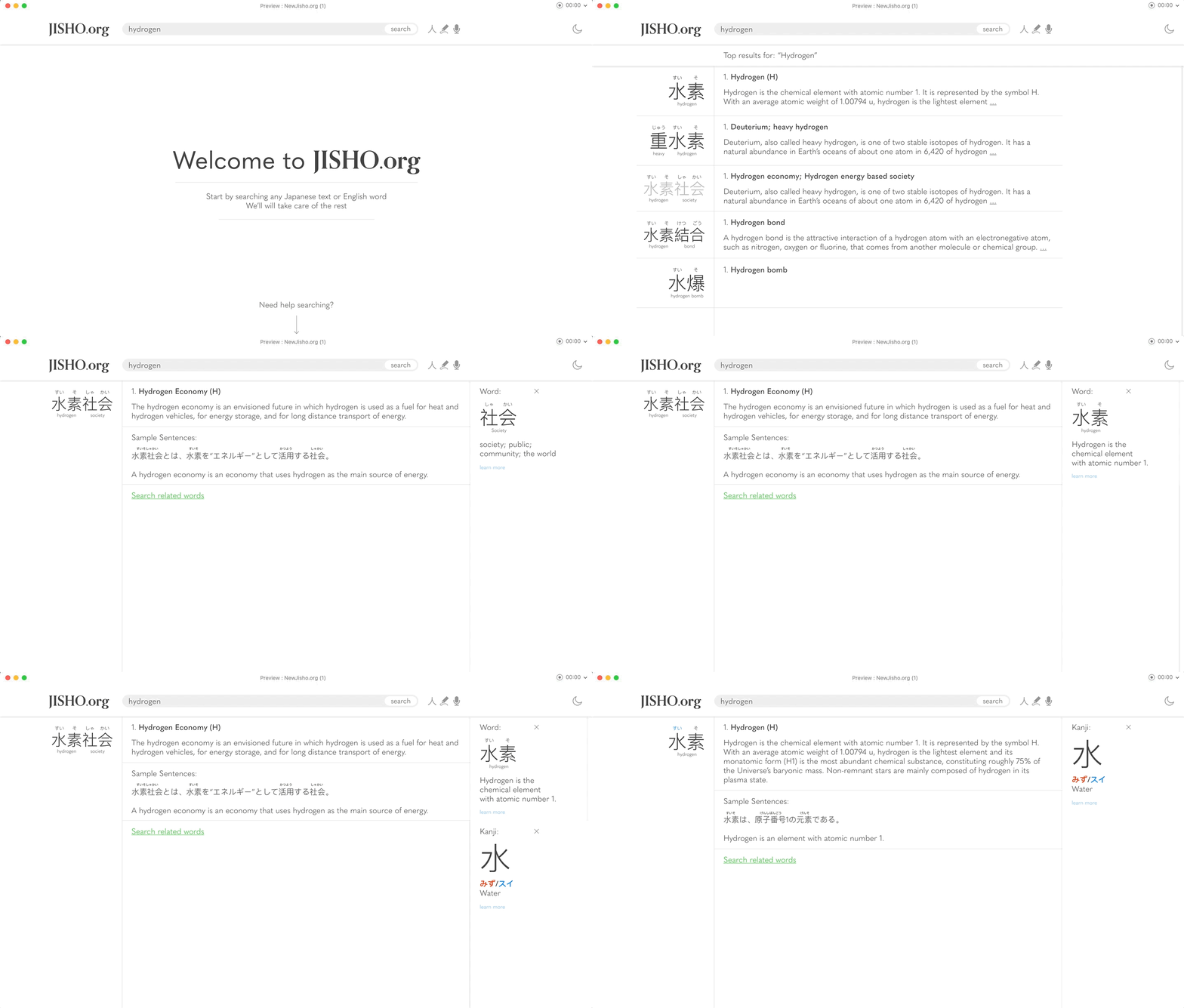
For example, when users users look up “hydrogen society”, they are presented with a four character compound word and the individual characters that make up the compound word. Since the compound word cant be broken down into individual words, users are unable to comprehend which characters make up “hydrogen” and “society”.
P R O B L E M O N E
Solution
To fix the break in the flow
Direct translations of the compound words are presented underneath
Users can click to open a side panel menu that shows the individual words
Users are also still able to explore the individual characters in the compound word by clicking the readings on top of each of the characters
P R O B L E M T W O
Lack of Visual Dividers
Because kanji were adopted from China (Hanzi), most kanji have at least two ways to read it. These pronunciations can be categorized into 2 groups called on’yomi and kun’yomi readings.
The former pronunciations come from early to late middle Chinese. The latter comes from Japanese words retrofitted onto these adopted characters.
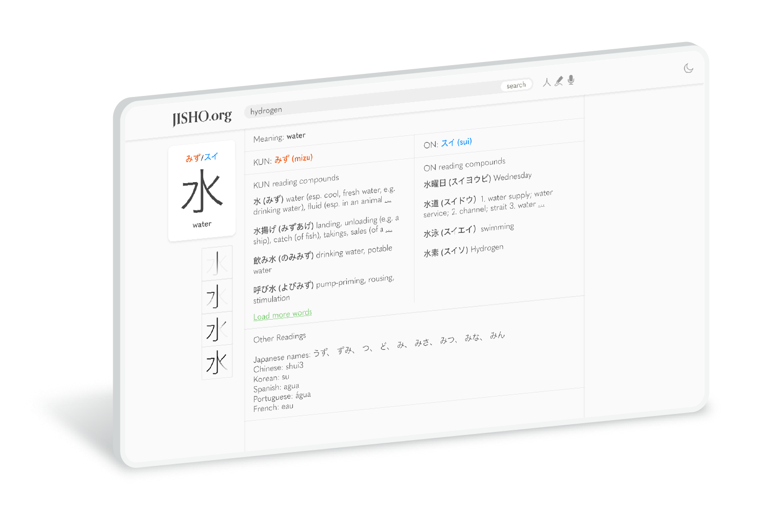
In its current form, there is zero visual separation between these two readings. The readings are stacked on top of each other making them hard to distinguish.
P R O B L E M T W O
Solution
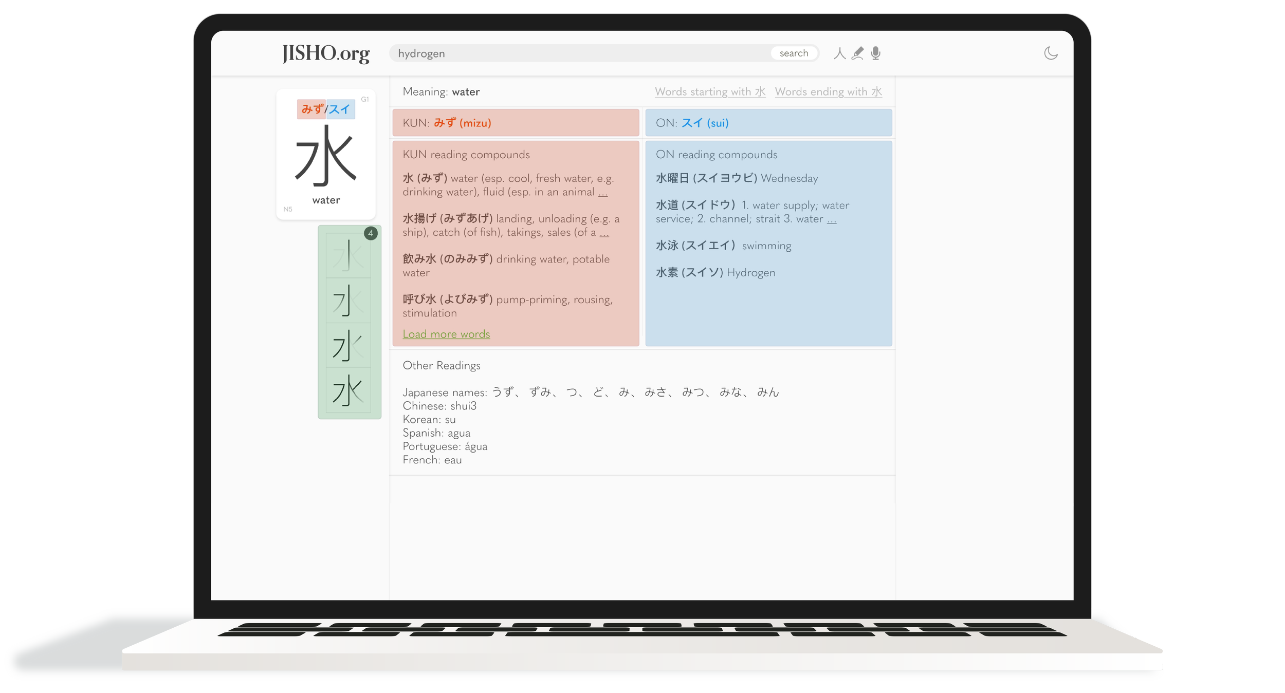
To distinguish the on’yomi and kun’yomi readings, they were:
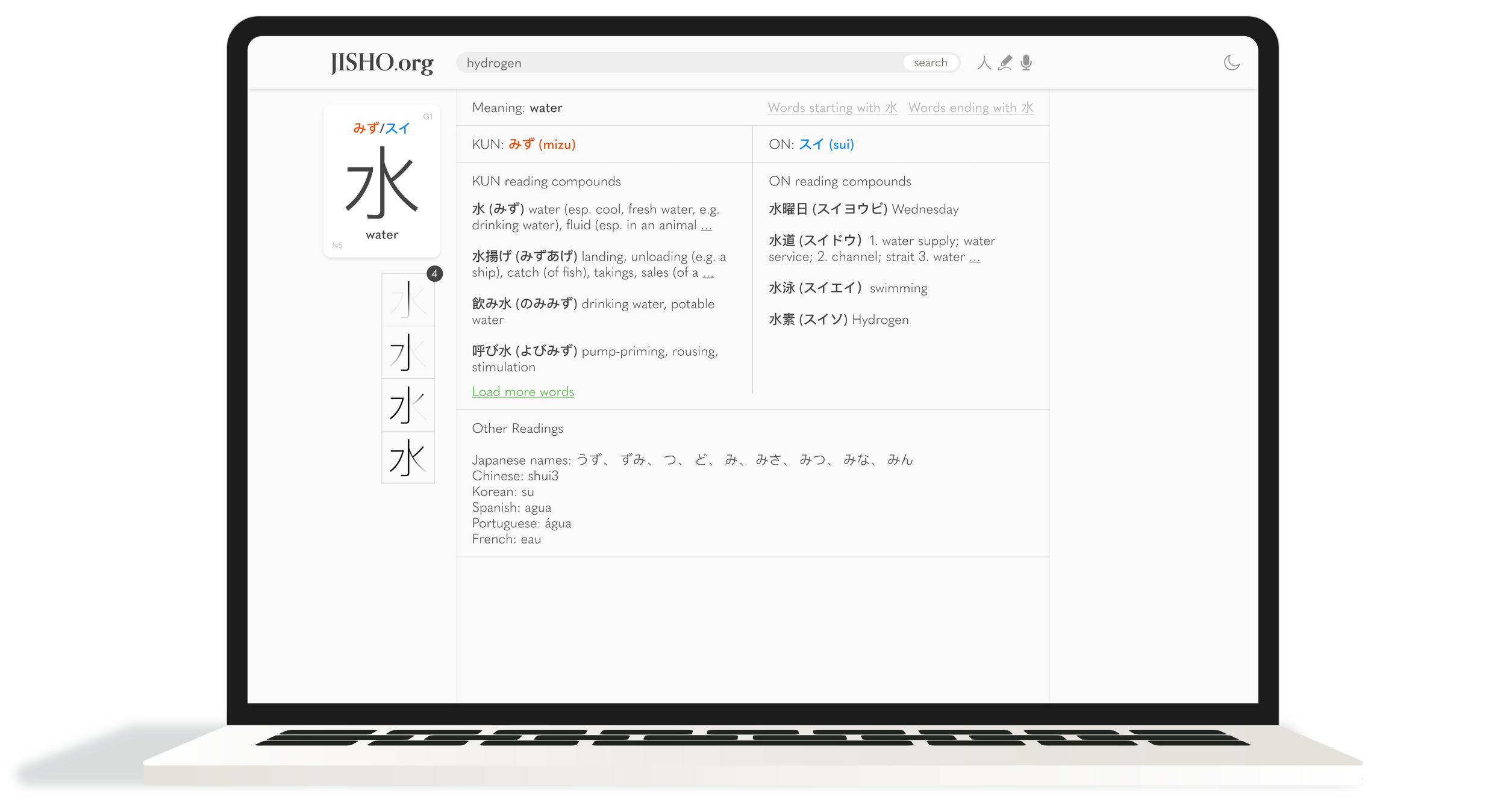
color coded into red and blue with red representing the kun’yomi and blue representing the on’yomi readings
Hovering over these readings as they appear across the website will also reveal them in their appropriate colors
P R O B L E M T H R E E
Visual Clutter
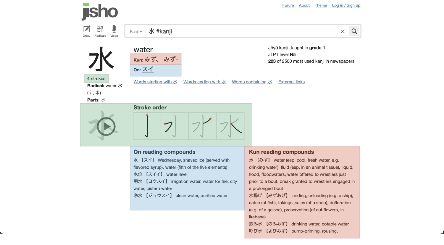
Current design is visually disorganized
Unnecessary separation of elements
Poor visual flow
Poor visual hierarchy
P R O B L E M T H R E E
Solution
Reorganization of site elements include:
Stacking now color coded readings on top of their example reading compounds
Creating a vertical visual flow using columns
Creating separated sections using divider lines
Kanji “card” to highlight the most important elements (the character and its readings)
Thank you!
You have reached the end
